URBANBRUSH PORTFOLIO
- Designed by Urbanbrush
- Work : 2024.8
- Client : 주식회사 제라헌
Jerahun Branding
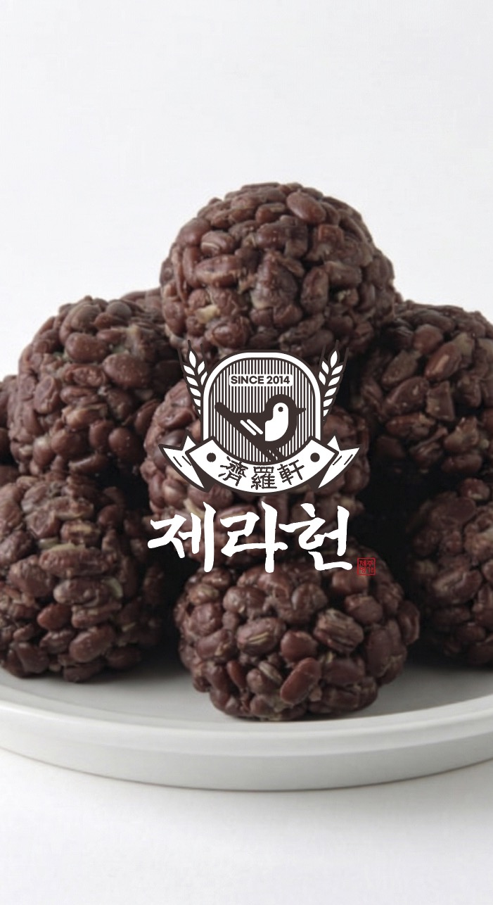
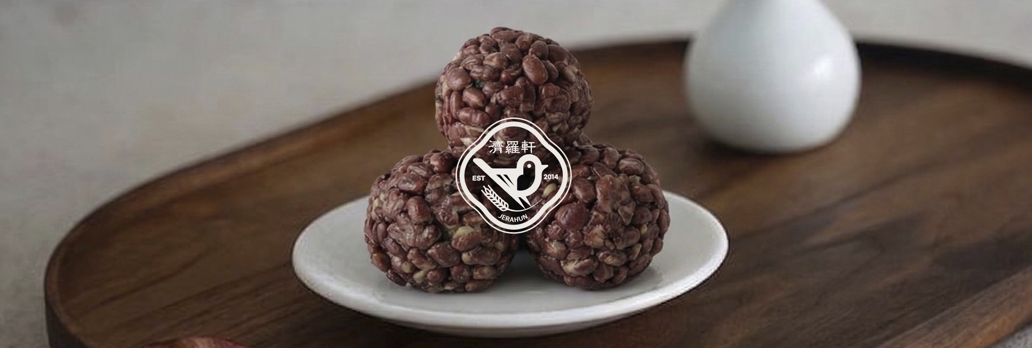
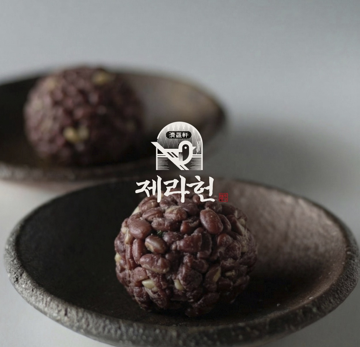
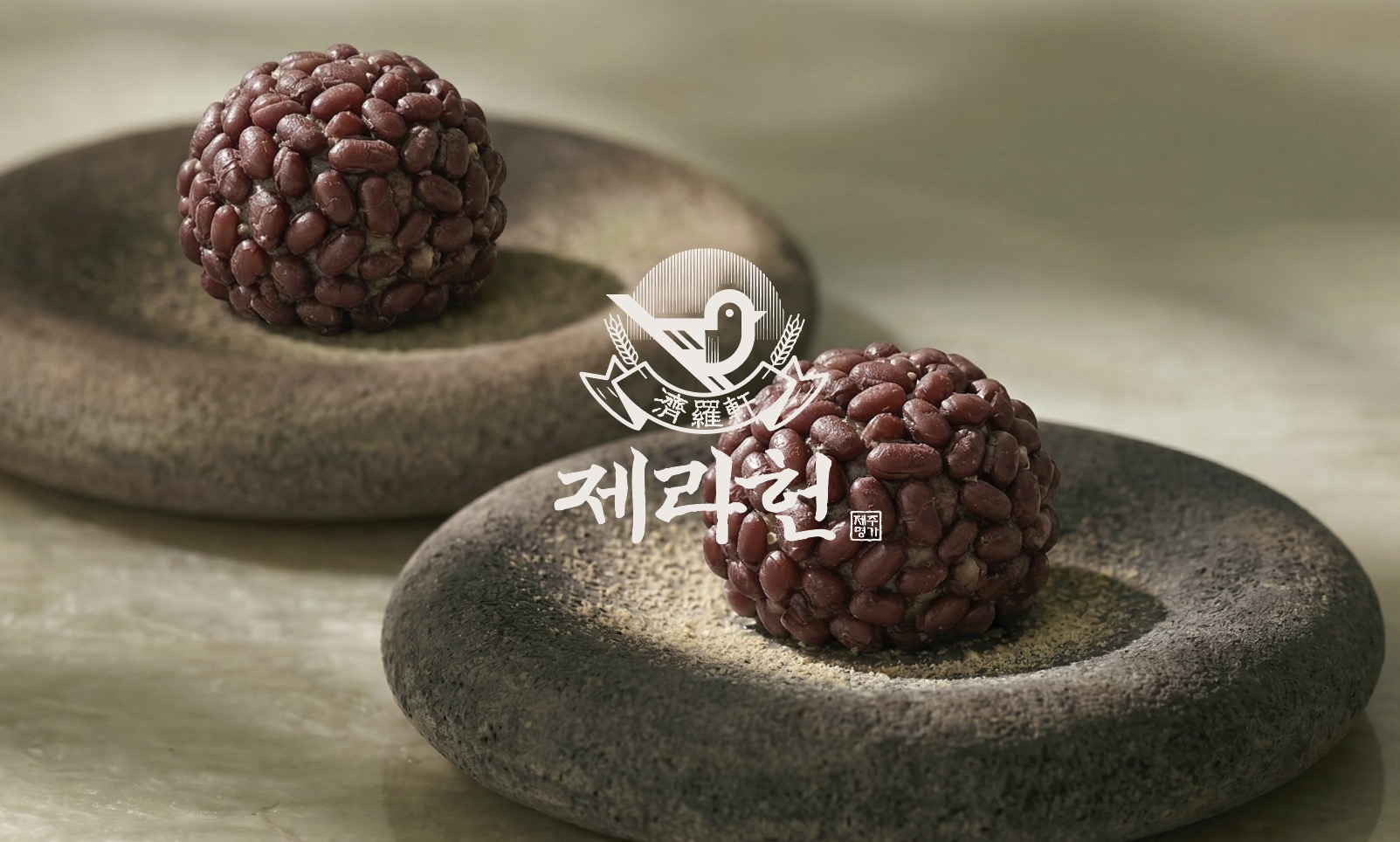
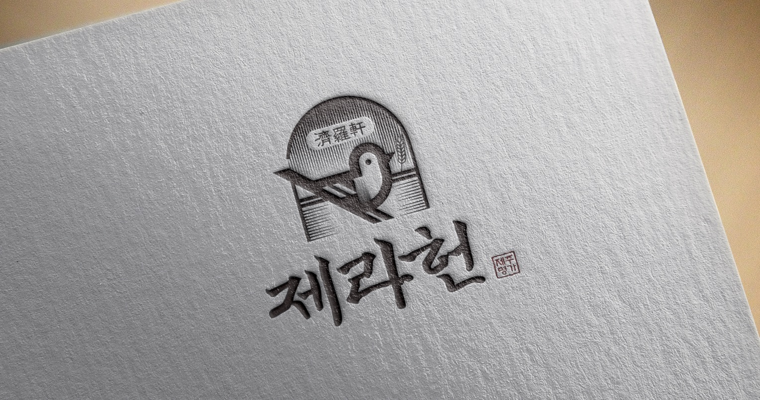
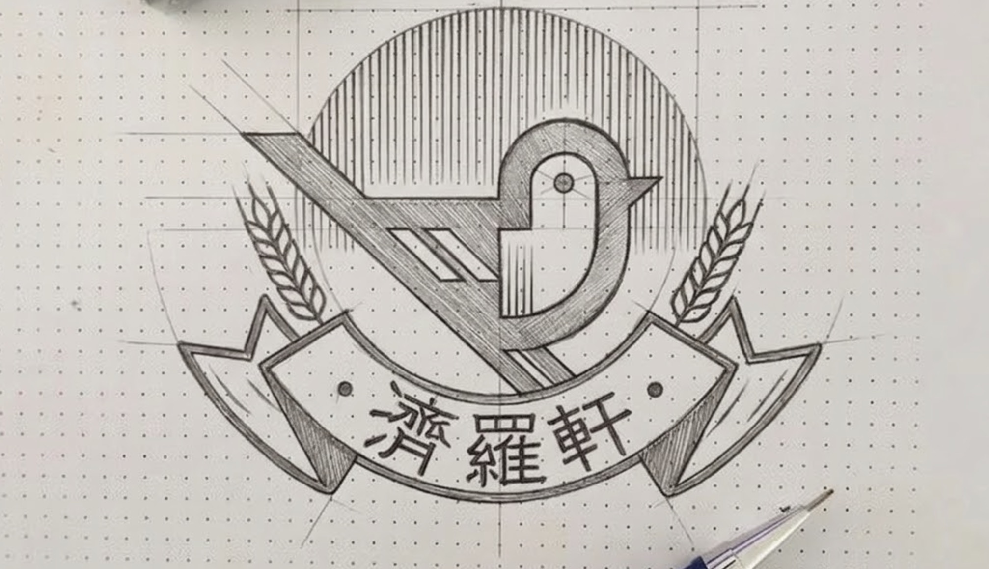
제주 방언 ‘제라하다(제대로이다)’의 의미를 담아, 브랜드의 진정성과 고유한 가치를 시각적 언어로 풀어냈습니다. 단순히 예쁜 로고를 넘어, 고객에게 신뢰를 전달하고 시장에서 독보적인 존재감을 드러내는 제라헌만의 디자인 철학과 세밀한 구현 과정을 포트폴리오를 통해 직접 확인해 보세요.
- our customers love us
At Urban Brush, we believe that true design begins where the ordinary ends. We don't just create visuals; we redefine how the world is perceived. Our philosophy is rooted in uncovering hidden values within the familiar and breaking away from standardized forms to complete a unique narrative for every brand.
by Urbanbush
Redefining the Standard of Design
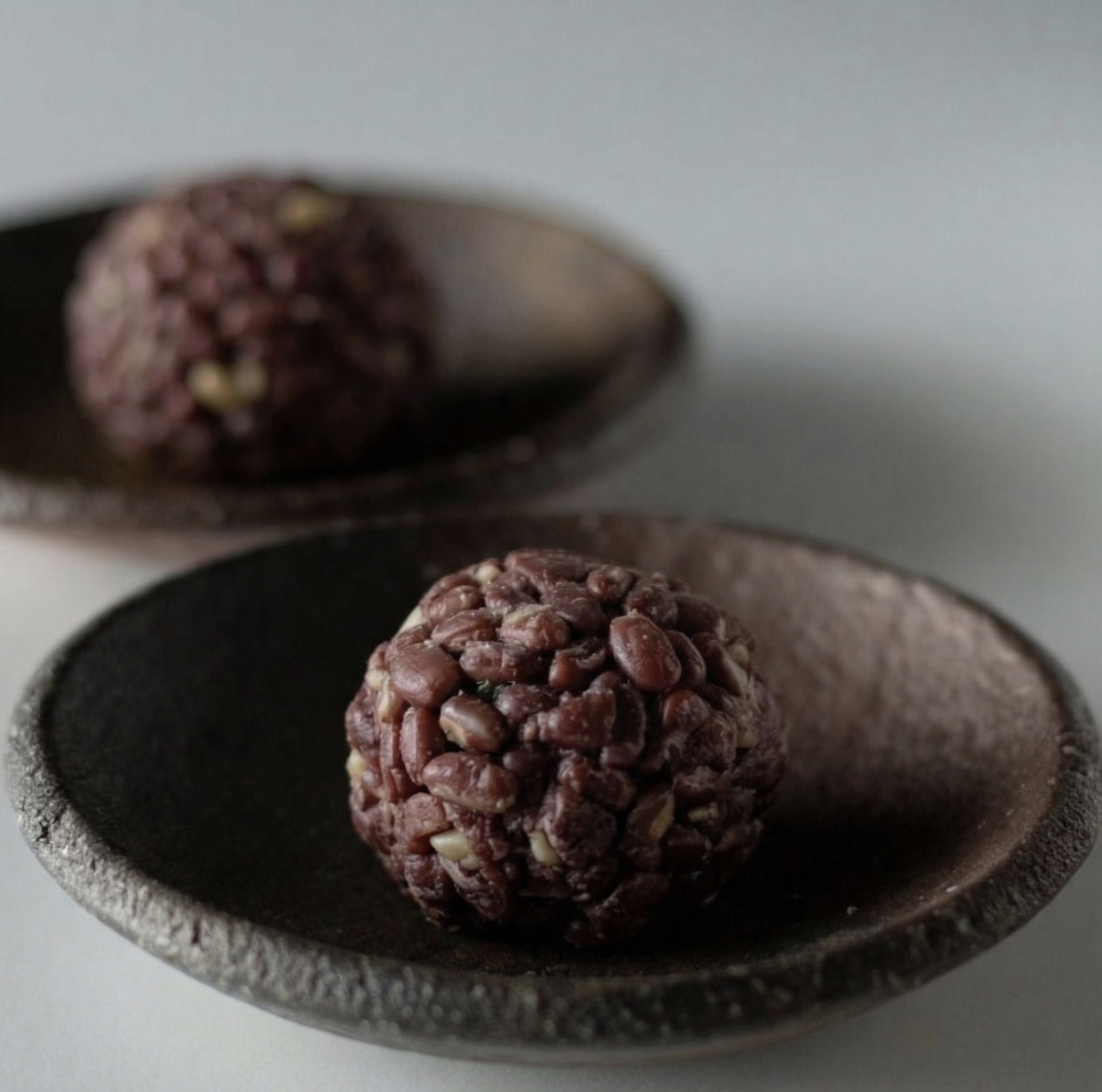
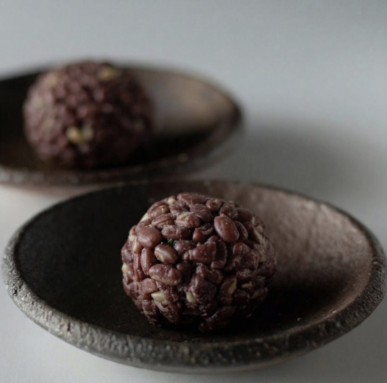
Jeju Local Food Branding
Jerahun!
어반브러시 제주토속식품 브랜딩 작업 포트폴리오
Think Different, Design Better.
브랜드를 결정하는 중요한 요소는 바로 ‘다름’입니다. 어반브러시는 끝임없이 우리의 작업이 무엇이 다른지를 고민합니다.
- 작업기간 : 2024. 04 ~ 2024. 08
- 작가 : Tommy / Urbanbrush Team
- 작업내역 : 브랜드 심볼마크, 리브랜딩, 색감, 로고 컨셉라인
Redefining the Standard of Design
About Our Projects
브랜딩과 관련된 고민이 있다면 언제든 어반브러시로 연락주세요.
URBANBRUSH
Redefining the Standard of Design
Urban Brush: Crafting a Different Perspective
Main Style
Main Color + Gray
Sub Color
Online + Social Media
Package Color
Offline + Package
Project Detail
A short description that introduces visitors to your portfolio.
The art of reading trends
브랜드에 대해 고민이 있다면 어반브러시와 상담하세요.
Contact Us
디자인문의가 있다면 어반브러시로 연락주세요.
© 2026 All Rights Reserved.