어반브러시 작업 포트폴리오
브랜드가 고민이라면 어반브러시와 상담하세요.
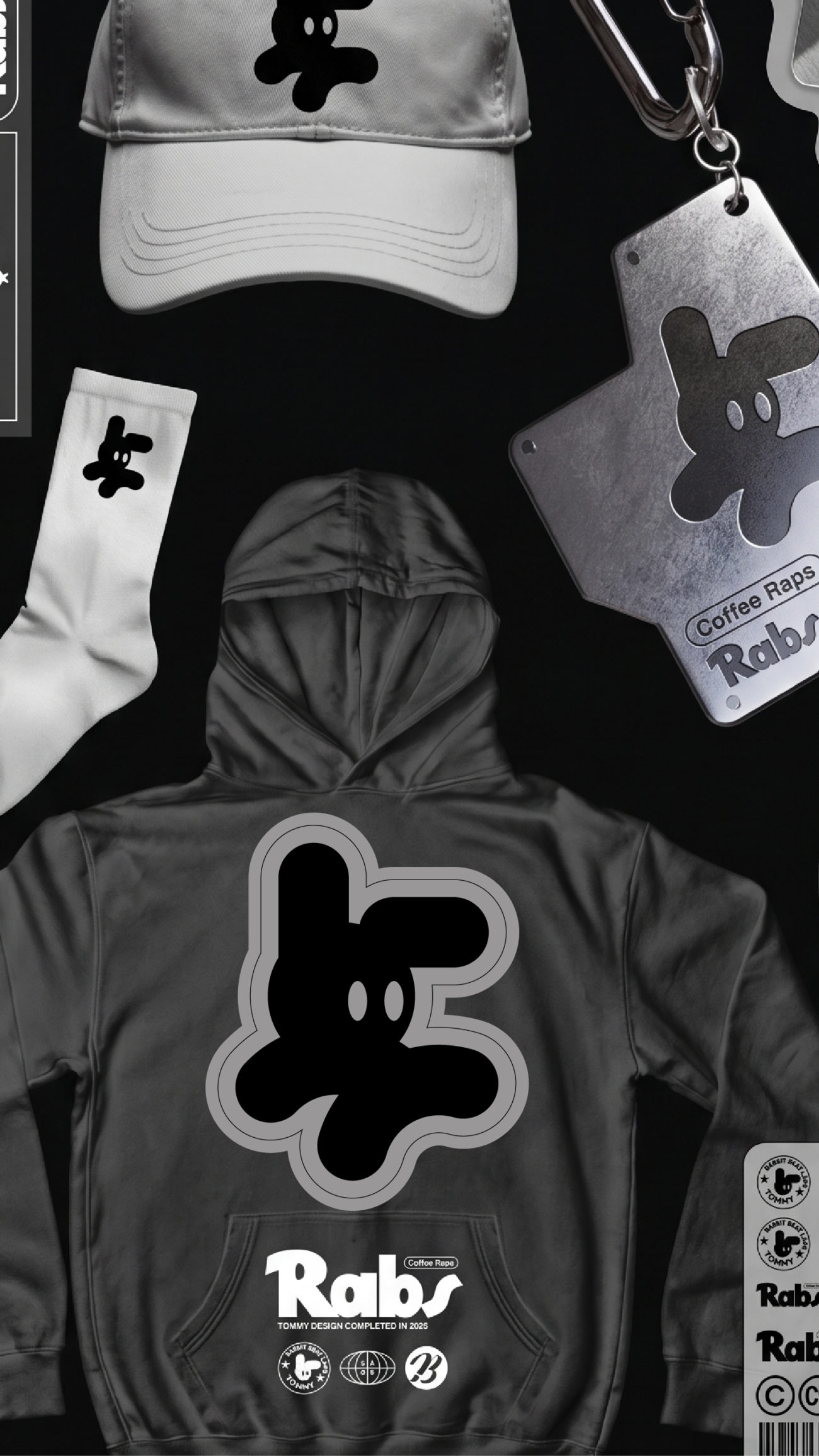
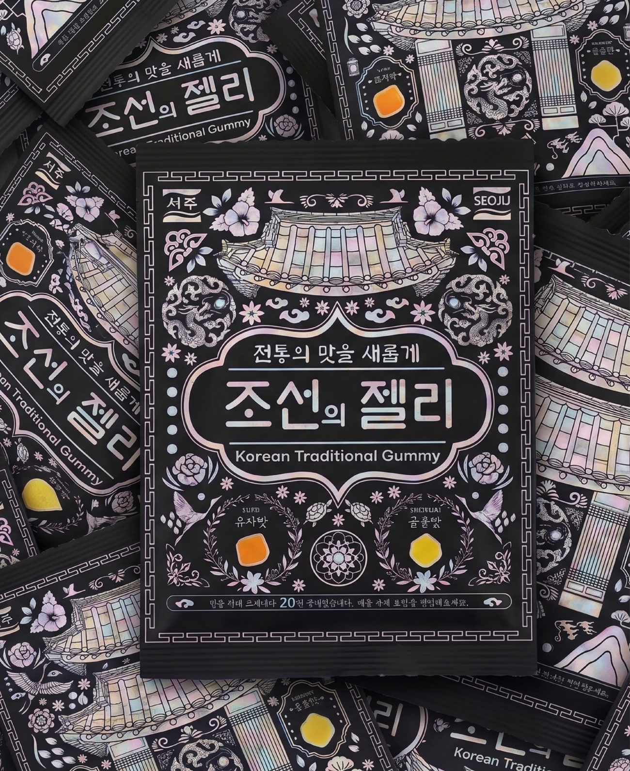
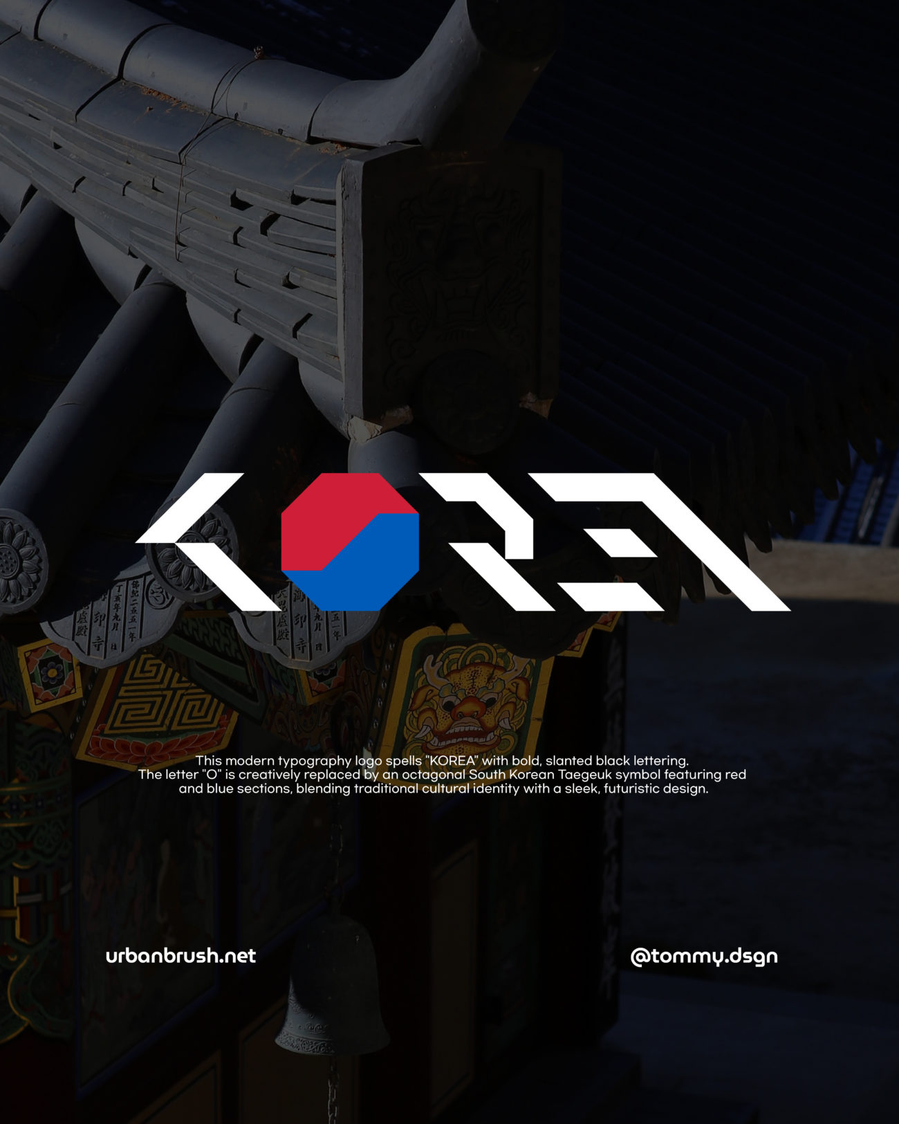
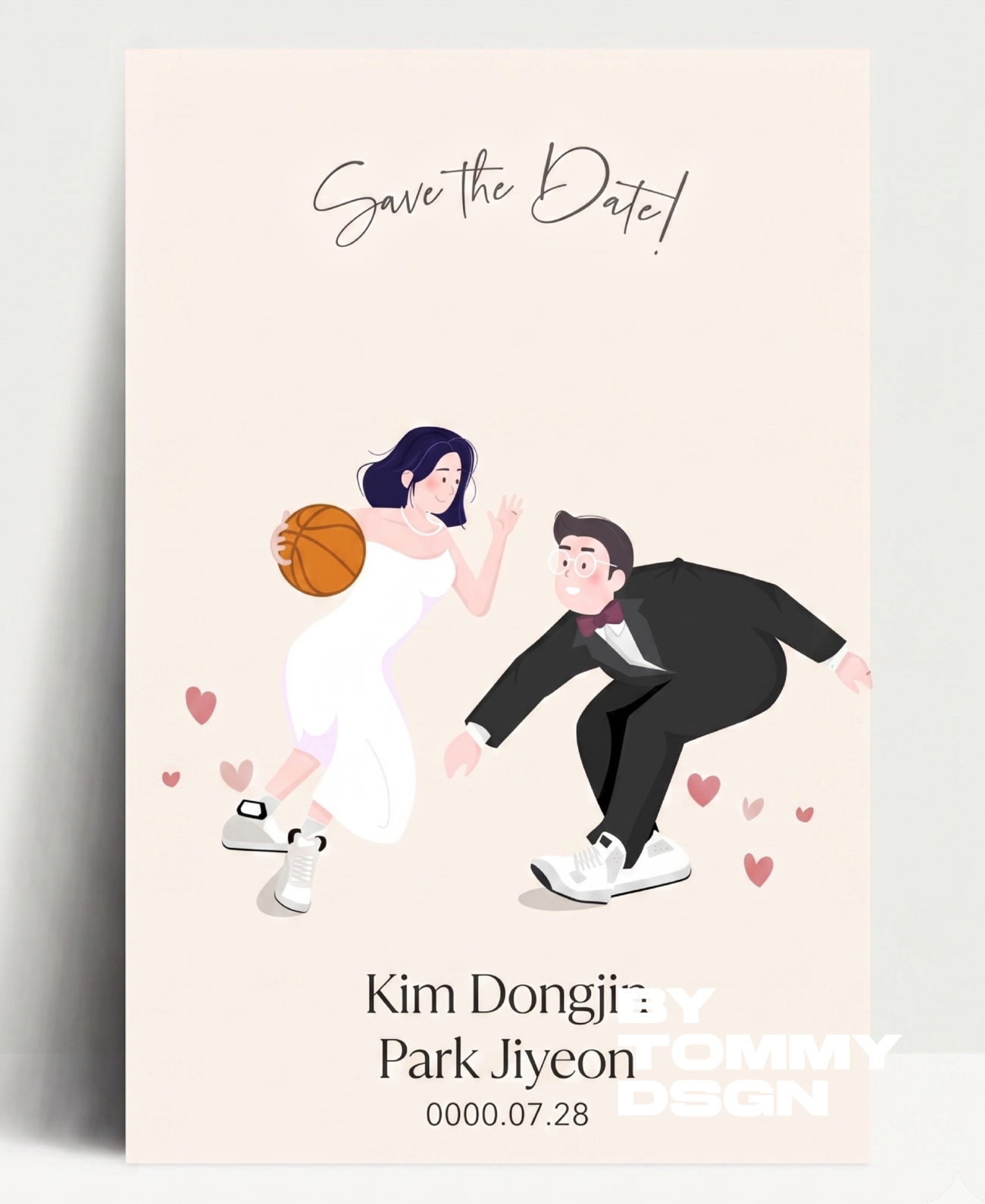
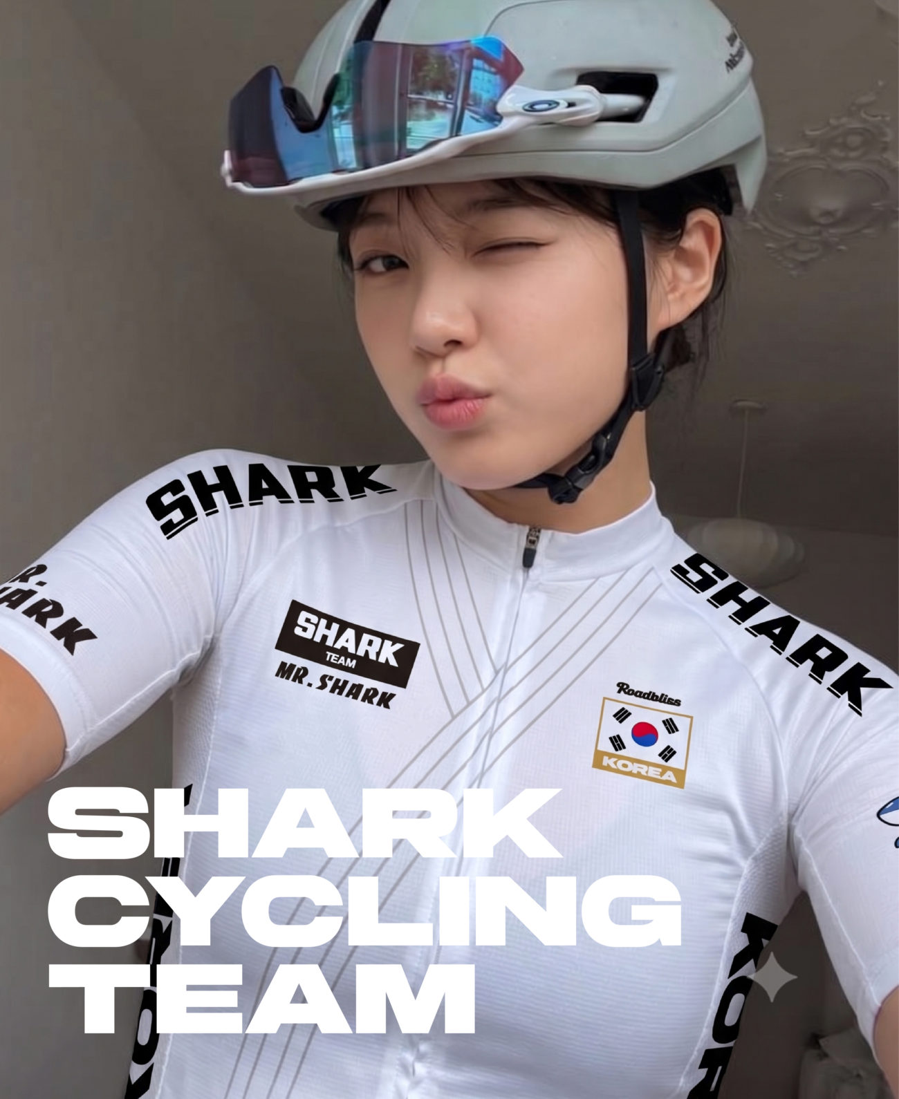
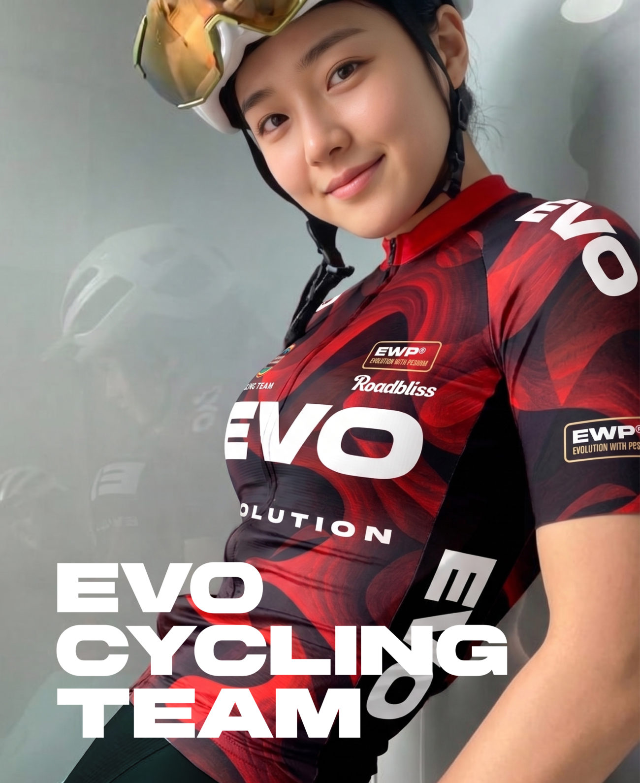
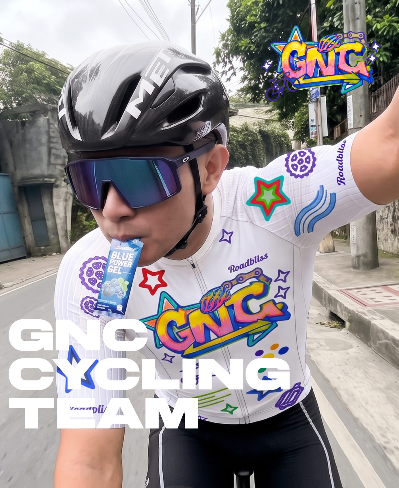
## Portfolio: Cultural Geometry & “Korean Consonant” Minimalist Identity
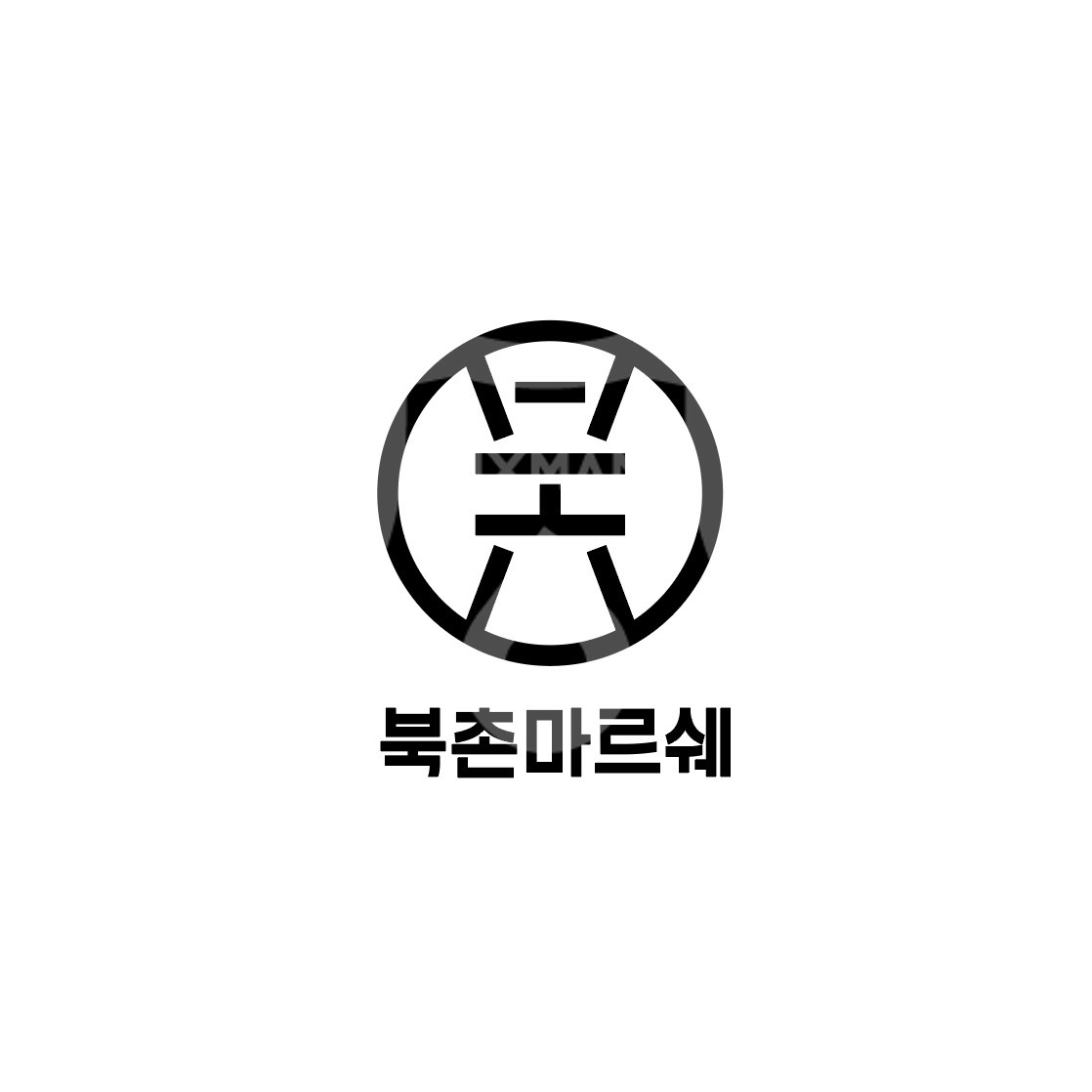
안녕하세요, 한글이 가진 조형적 아름다움과 브랜드의 핵심 가치를 절제된 시각 언어로 구현하여 독창적인 아이덴티티를 디자인하는 디자이너 **타미(Tommy)**입니다. 이번에 소개해 드릴 프로젝트는 상호의 첫 글자인 한글 자음을 현대적으로 재해석하여 하나의 상징적인 기호로 담아낸 **’한글 자음 로고 CI·BI 디자인’** 포트폴리오입니다.
단순한 글자의 나열을 넘어, 브랜드의 정체성을 가장 직관적이고 예술적으로 시각화하기 위해 **’한글 자음의 기하학적 구조’와 ‘심볼릭 미니멀리즘’**을 디자인의 핵심 구조로 설정했습니다. 자음의 획과 공간이 유기적으로 맞물려 완성된 하나의 심볼은 비즈니스가 지향하는 **본질에 집중하는 태도, 한국적 정체성을 기반으로 한 글로벌 감각, 그리고 세련된 브랜드 서사**라는 가치를 시각화합니다. 특히 자음 고유의 형태감을 유지하면서도 업종의 특성에 맞는 선의 굵기와 곡률을 적용하여, 어떤 매체에서도 선명한 인상을 남기도록 정교하게 설계했습니다.
이 디자인은 **K-브랜딩을 지향하는 스타트업, 전통문화 기반의 현대적 라이프스타일 브랜드, 한글 네이밍을 사용하는 디자인 스튜디오 및 컨설팅 기업**, 그리고 간결하면서도 깊이 있는 심볼을 통해 브랜드의 전문성을 각인시키고 싶은 모든 **아이덴티티 브랜딩 비즈니스**에 최적화된 토탈 솔루션입니다. 기업의 공식 사명(CI)부터 브랜드의 대표 얼굴(BI), 제품 패키징의 인장 디자인, 건축물의 사이니지, 웹사이트 파비콘 및 각종 문서 서식에 이르기까지 브랜드의 독보적인 정체성과 조형적 서사를 완성해 주는 프리미엄 브랜딩 결과물입니다.
Hi, I’m **Tommy**, a designer who designs unique identities by implementing the formative beauty of Hangeul and the core values of a brand into a restrained visual language. This project features the **”Korean Consonant Logo CI·BI Design”** portfolio, which modernly reinterprets the initial consonants of a brand name into a single symbolic sign.
Moving beyond a simple arrangement of letters, I set the **geometric structure of Korean consonants and symbolic minimalism** as the core structures of the design to most intuitively and artistically visualize the brand’s identity. The single symbol, completed by organically interlocking the strokes and spaces of the consonants, visualizes the values of **an attitude focused on the essence, a global sense based on Korean identity, and a sophisticated brand narrative**. In particular, I elborately designed it by applying line thickness and curvature suitable for the industry characteristics while maintaining the unique shape of the consonants.
This identity is perfectly optimized for any **identity branding business** looking to imprint brand expertise through concise yet deep symbols, such as **startups aiming for K-branding, modern lifestyle brands based on traditional culture, and design studios using Hangeul naming**. It is a premium branding solution that completes a brand’s unique identity and formative narrative across various touchpoints, including official CI, BI, packaging seals, and website favicons.
—
**작업 분류(Keywords):**
한글 자음 로고 디자인 의뢰, 한글 심볼 BI 제작 포트폴리오, 자음 모티브 브랜딩 솔루션, 한글 타이포그래피 로고 기획 제작, 기업 CI 디자인 솔루션, 프리미엄 한글 아이덴티티, 미니멀리즘 로고 제작 전문, K-브랜드 디자인 전문, 디자이너 타미, 어반브러시, Korean consonant logo design request, Hangeul symbol BI portfolio, consonant-inspired branding solution, Hangeul typography logo planning, corporate CI design solution, premium Hangeul identity, minimalist logo specialist, K-brand design specialist, Tommy designer, Urban Brush
안녕하세요. 디자이너 Tommy입니다 🙂
저의 포트폴리오가 맘에 들어 작업을 의뢰하시고 싶다면,
이메일을 주시거나 카카오톡 ‘디자이너 타미‘를 검색해서 톡을 주세요!
hello. This is designer Tommy 🙂
If you like my portfolio and want to commission work,
Please email me or search KakaoTalk for ‘Designer Tammy’
and send me a message!
______________________________________
인스타그램 : https://www.instagram.com/inspired_tommy
이메일주소 : [email protected]
디자인 상담 : 카카오톡 ‘디자이너타미’
* 해당 이미지는 지적재산권을 보호받고 있음으로 불법복제 및 사용하는 경우 법적 처벌을 받을 수 있습니다.
Tommy Instagram